
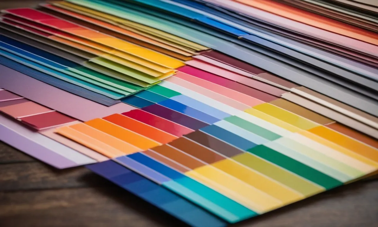
30 Colours And Their Meanings: A Comprehensive Guide
Colours are more than just pleasing hues that adorn our world; they are a language that speaks to our emotions, conveys messages, and influences our perceptions. From the vibrant reds that ignite passion to the calming blues that evoke serenity, each colour carries a unique meaning and symbolism.
If you’re short on time, here’s a quick answer to your question: The 30 colours covered in this article, along with their meanings, are: red (passion, love, anger), orange (energy, warmth, enthusiasm), yellow (happiness, optimism, caution), green (nature, growth, renewal), blue (calmness, stability, trust), purple (luxury, creativity, spirituality), pink (romance, femininity, playfulness), brown (earthy, reliable, rustic), black (power, elegance, mystery), white (purity, innocence, cleanliness), and many more.
In this comprehensive guide, we will delve into the fascinating world of colour psychology, exploring the meanings and symbolism associated with 30 distinct hues. From the bold and vibrant to the soft and muted, each colour will be examined in depth, providing valuable insights into how they influence our emotions, perceptions, and decision-making processes.
The Psychology of Colour
The Science Behind Colour Perception
Colour perception is a fascinating phenomenon that combines physics, biology, and psychology. According to Color Matters, the human eye contains specialized receptors called cones that are sensitive to different wavelengths of light, allowing us to perceive a wide range of colours.
However, colour perception is not just a physical process; it also involves complex neural pathways in the brain that interpret and assign meaning to these visual stimuli.
Interestingly, studies have shown that up to 90% of our judgments about products can be based on colour alone. This highlights the profound impact that colour can have on our perceptions and decision-making processes.
For instance, warm colours like red and orange tend to evoke feelings of excitement and energy, while cool colours like blue and green are often associated with calmness and tranquility. 😊
Cultural and Historical Influences on Colour Meanings
While colour perception has a biological basis, the meanings and symbolism attached to colours are heavily influenced by cultural and historical factors. For example, in Western cultures, white is often associated with purity and innocence, while in many Eastern cultures, it symbolizes mourning and death.
Similarly, the colour red can represent love and passion in some contexts, but also danger and aggression in others.
Throughout history, colours have played significant roles in various societies and belief systems. Ancient Egyptians associated specific colours with different deities, while in medieval Europe, certain colours were reserved for royalty and nobility.
Today, we can still see the influence of these cultural associations in art, fashion, and even marketing strategies. Isn’t it amazing how colours can carry such rich and diverse meanings across different cultures? 🌈
The Role of Colour in Branding and Marketing
In the world of branding and marketing, colour is a powerful tool that can evoke specific emotions, reinforce brand identity, and influence consumer behavior. According to Entrepreneur, up to 85% of consumers cite colour as the primary reason for buying a particular product.
Marketers and designers carefully select colour palettes that align with their brand’s desired image and messaging.
For instance, many fast-food chains use shades of red and yellow, which are known to stimulate appetite and create a sense of urgency. In contrast, luxury brands often opt for muted tones like black, white, and metallic shades, conveying sophistication and exclusivity.
Colour can also play a role in differentiating products within the same category, making them more memorable and recognizable to consumers. Don’t you find it fascinating how colours can shape our purchasing decisions in such subtle yet impactful ways? 👏
Warm Colours and Their Meanings
Red: Passion, Love, and Anger
Red is a powerful and intense colour that evokes strong emotions. It is often associated with passion, love, and desire, making it a popular choice for romantic occasions like Valentine’s Day. According to Color Psychology, red is also linked to anger and aggression, which is why it is frequently used in warning signs and stop lights.
In Eastern cultures, red symbolizes good luck and prosperity, while in Western cultures, it can represent danger or courage. Interestingly, a study by the University of British Columbia found that athletes who wore red were perceived as more dominant and successful, potentially giving them a psychological advantage.
Orange: Energy, Warmth, and Enthusiasm
Orange is a vibrant and energetic colour that radiates warmth and enthusiasm. It is often associated with creativity, adventure, and excitement. According to Smashing Magazine, orange is a friendly and uplifting colour that can stimulate appetite and encourage social communication.
It is frequently used in branding and advertising to grab attention and convey a sense of playfulness. However, too much orange can be overwhelming, so it’s essential to use it in moderation. Did you know that the orange colour was named after the fruit?
😊 It’s a fun fact that adds a touch of warmth and joy to the colour’s meaning.
Yellow: Happiness, Optimism, and Caution
Yellow is a bright and cheerful colour that is often associated with happiness, optimism, and sunshine. It is a warm and welcoming colour that can instantly uplift moods and create a sense of positivity.
According to Verywell Mind, yellow is also linked to intellect and creativity, making it a popular choice for educational settings and study materials. However, too much yellow can be overwhelming and cause eye strain, so it’s important to use it judiciously.
Interestingly, yellow is also used as a cautionary colour in traffic signs and hazard warnings, reminding us to be alert and cautious. Did you know that yellow is one of the most visible colours to the human eye? 👀 This fact adds to the meaning of yellow as a colour that demands attention and caution.
| Colour | Meanings | Fun Facts |
|---|---|---|
| Red | Passion, love, anger, danger, courage | Athletes wearing red are perceived as more dominant and successful. |
| Orange | Energy, warmth, enthusiasm, creativity, adventure | The colour was named after the fruit. |
| Yellow | Happiness, optimism, intellect, caution | One of the most visible colours to the human eye. |
Cool Colours and Their Meanings
Green: Nature, Growth, and Renewal
Green is a cool, refreshing colour that symbolizes nature, growth, and renewal. It is often associated with the environment, sustainability, and eco-friendliness. The colour green can evoke feelings of harmony, balance, and tranquility.
According to a study by Color Matters, green is one of the most popular colours used in branding and marketing, particularly for companies that promote eco-friendly or natural products. In fact, 62% of consumers consider green as a colour that represents good environmental practices.
Green is also believed to have a calming effect on the mind and body. It can help reduce stress and anxiety levels, making it a popular choice for healthcare facilities and spas. Additionally, green is often used in classrooms and workspaces to promote concentration and productivity.
The versatility of green makes it a popular choice across various industries and settings.
Blue: Calmness, Stability, and Trust
Blue is a cool, serene colour that evokes feelings of calmness, stability, and trust. It is often associated with the sky, water, and other natural elements, making it a popular choice for brands that want to convey a sense of reliability and trustworthiness.
According to a survey by Entrepreneur, blue is the most popular colour among men (57%), while 35% of women prefer blue.
In the corporate world, blue is widely used to represent professionalism, intelligence, and competence. Many financial institutions, technology companies, and healthcare organizations incorporate blue into their branding to instill a sense of confidence and reliability in their customers.
The calming effects of blue can also be beneficial in healthcare settings, as it has been shown to lower blood pressure and heart rate.
Purple: Luxury, Creativity, and Spirituality
Purple is a rich, luxurious colour that combines the stability of blue and the energy of red. It is often associated with royalty, luxury, and creativity. According to a study by Color Psychology, purple can evoke feelings of imagination, spirituality, and individuality.
In the fashion and beauty industries, purple is frequently used to convey a sense of sophistication and elegance. Many high-end brands incorporate shades of purple into their branding and product lines to appeal to consumers seeking a touch of luxury.
Additionally, purple is often associated with creativity and artistic expression, making it a popular choice for artists, musicians, and other creative professionals. Whether used in branding, design, or personal expression, purple is a captivating colour that can evoke a range of emotions and meanings.
Neutral Colours and Their Meanings
Neutral colours are often overlooked, but they hold a special place in the world of colour symbolism and meaning. These versatile hues can convey a range of emotions and associations, making them a valuable addition to any colour palette.
Pink: Romance, Femininity, and Playfulness
Pink is a delicate and gentle colour that is often associated with love, romance, and femininity. It evokes a sense of tenderness and compassion, making it a popular choice for baby clothing and nursery decor. However, pink can also represent playfulness and innocence, particularly in lighter shades.
According to color psychology, pink has been shown to have a calming effect on the mind and body, reducing feelings of aggression and anxiety.
Brown: Earthy, Reliable, and Rustic
Brown is a warm and grounding colour that is closely tied to nature and the earth. It represents stability, reliability, and a sense of being down-to-earth. This colour is often associated with natural materials such as wood, leather, and soil, giving it a rustic and organic feel.
Brown can also convey a sense of comfort and security, making it a popular choice for interior design and home decor. In fact, a study by Psychology Today found that people who prefer brown are often seen as trustworthy and dependable.
Black: Power, Elegance, and Mystery
Black is a bold and powerful colour that exudes sophistication and elegance. It is often associated with authority, strength, and mystery. In fashion, black is a timeless and versatile choice that can convey a sense of confidence and style.
However, black can also have negative connotations, such as sadness, darkness, and evil, depending on the context. According to color psychology, black is the most popular colour for luxury brands, as it is perceived as sleek, modern, and high-end.
White: Purity, Innocence, and Cleanliness
White is a pure and pristine colour that symbolizes purity, innocence, and cleanliness. It is often associated with fresh beginnings, peace, and simplicity. In many cultures, white is used in weddings and religious ceremonies to represent purity and new beginnings.
However, white can also convey a sense of emptiness or coldness if used excessively. In design, white is often used to create a clean and minimalist look, providing a blank canvas for other colours to shine. Did you know that in Western cultures, white is the most popular colour for website designs?
According to a study by WebFX, 😊 over 90% of websites use white as their primary colour.
Colour Combinations and Their Meanings
Beyond the individual meanings of colours, their combinations can convey powerful messages and evoke specific emotions. Colour combinations are a vital aspect of design, branding, and visual communication.
By understanding the meanings behind these combinations, you can create visually striking and impactful designs that resonate with your audience.
Complementary Colour Combinations
Complementary colours are those that sit opposite each other on the colour wheel, such as red and green, blue and orange, or yellow and purple. These combinations create a high-contrast, vibrant, and eye-catching effect.
According to a study by Color Matters, 👍 complementary colour schemes are highly effective for grabbing attention and are often used in logos, advertisements, and marketing materials. However, they can also appear jarring or overwhelming if not balanced properly.
Analogous Colour Combinations
Analogous colours are those that sit next to each other on the colour wheel, such as blue and green, or red and orange. These combinations create a sense of harmony and cohesion, making them a popular choice for branding and interior design.
According to a study by Pantone, analogous colour schemes can evoke feelings of tranquility, comfort, and relaxation. 😊 They are often used in spa settings, nature-inspired designs, and calming environments.
Triadic Colour Combinations
Triadic colour combinations consist of three colours that are evenly spaced on the colour wheel, creating a balanced and visually appealing palette. These combinations can be bold and dynamic, or more subdued and harmonious, depending on the specific colours used.
A study by Color Matters found that triadic colour schemes are often used in branding and packaging to create a sense of energy and vibrancy. 🎉 They can also be effective in conveying a sense of balance and stability, making them a versatile choice for various design applications.
While individual colours hold their own meanings, their combinations can amplify or modify those meanings, creating a rich tapestry of visual communication. By understanding the nuances of colour combinations, designers and marketers can create visually stunning and emotionally resonant designs that effectively communicate their intended messages.
Conclusion
Colours are more than just visual stimuli; they are powerful tools that can shape our emotions, influence our decisions, and convey profound messages. By understanding the meanings and symbolism associated with each hue, we can harness the power of colour to create meaningful connections, evoke desired emotions, and communicate effectively.
Whether you’re a designer, marketer, artist, or simply someone who appreciates the beauty and depth of colours, this comprehensive guide has provided you with a wealth of knowledge about the 30 colours and their meanings.
Embrace the vibrant tapestry of hues and let them enrich your life, enhance your creativity, and deepen your understanding of the world around you.