The Comprehensive Color Meaning Chart: Unveiling The Symbolism And Psychology Behind Every Hue
Colors are more than just visual stimuli; they are powerful symbols that evoke emotions, convey messages, and influence our perceptions. From the vibrant red that ignites passion to the calming blue that soothes the soul, every hue carries a unique meaning and significance.
If you’re short on time, here’s a quick answer to your question: The color meaning chart is a comprehensive guide that explores the symbolism, psychology, and cultural associations behind various colors, providing insights into how they can impact our emotions, behaviors, and decision-making processes.
In this article, we will delve into the fascinating world of color psychology, uncovering the hidden meanings and symbolism behind each hue. We will explore the cultural and historical significance of colors, their psychological effects, and their applications in various industries, from marketing and branding to interior design and fashion.
The Psychology of Color
The Science Behind Color Perception
Color perception is a fascinating interplay between physics, biology, and psychology. When light waves of different wavelengths enter our eyes, they are detected by specialized photoreceptor cells called cones.
These cones, with their three distinct types (sensitive to red, green, and blue light), enable us to perceive a vast spectrum of colors. However, color perception goes beyond mere physical detection. Our brains interpret these signals, combining them with our experiences, emotions, and cultural associations to create a rich tapestry of color meanings.
According to research from Color Matters, 92.6% of people judged products by their color alone, highlighting the profound impact of color on our perceptions.
Color and Emotions: The Psychological Impact
Colors have the remarkable ability to evoke powerful emotional responses within us. This connection between color and emotion is deeply rooted in our evolutionary history and psychological associations.
For instance, warm colors like red and orange are often linked to feelings of energy, passion, and excitement, while cooler hues like blue and green tend to promote a sense of calmness and tranquility.
According to a study by the Association for Psychological Science, colors can influence our moods, emotions, and even cognitive performance. The study found that participants performed better on detail-oriented tasks when exposed to red, while blue enhanced creative thinking.
Interestingly, color preferences and associations can vary across individuals, influenced by personal experiences, cultural backgrounds, and even gender. For example, a study published in the Journal of Cross-Cultural Psychology revealed that women tend to prefer warmer colors like red and purple, while men often gravitate towards cooler shades like blue and green.
Cultural and Historical Influences on Color Meanings
The meanings and symbolism associated with colors are not universal but are deeply shaped by cultural and historical influences. For instance, in Western cultures, white is often associated with purity and innocence, while in many Eastern cultures, it symbolizes mourning and death.
Similarly, the color red holds vastly different connotations across various societies – it can represent love and passion in some, while signifying danger or prosperity in others. These cultural associations are deeply ingrained and can profoundly impact our perceptions and responses to colors.
Throughout history, colors have played significant roles in art, religion, and societal traditions. The ancient Egyptians used vibrant hues in their hieroglyphics and tomb paintings, each color carrying specific symbolic meanings.
In Hinduism, colors like saffron, white, and red hold sacred significance, while in Christianity, colors like purple and gold are closely tied to royalty and divinity. These deep-rooted cultural and historical influences continue to shape our understanding and interpretation of color meanings to this day.
Understanding the psychology of color is not only fascinating but also holds practical applications in fields such as marketing, design, and even therapy. By harnessing the power of color, we can create environments, products, and experiences that resonate with our emotions and cultural associations, ultimately enhancing our overall well-being and quality of life.
The Color Meaning Chart: A Comprehensive Guide
Colors are more than just pleasing hues that adorn our world – they carry profound symbolism and psychological associations that have captivated humans for centuries. From the fiery passion of red to the serene tranquility of blue, each color holds a unique meaning that resonates with our emotions and perceptions.
In this comprehensive guide, we’ll unveil the symbolism and psychology behind every hue, providing you with a deeper understanding of the colors that surround us.
Red: Passion, Energy, and Power
Red is a bold and intense color that evokes strong emotions. It is often associated with passion, desire, and love, making it a popular choice for romantic occasions and expressions of affection. However, red also symbolizes energy, power, and courage.
According to a study by Color Psychology, red can increase heart rate and stimulate appetite, which is why it’s commonly used in restaurant logos and branding. In sports, red is worn by athletes to convey determination and a competitive spirit.
Whether it’s a vibrant red dress or a sleek red sports car, this color demands attention and exudes confidence.
Blue: Tranquility, Trust, and Stability
Blue is a calming and serene color that instills a sense of trust and stability. It is often associated with the vast expanse of the sky and the depths of the ocean, evoking feelings of peace and tranquility.
In the business world, blue is a popular choice for corporate branding, as it conveys professionalism and reliability. Color Matters reports that blue is the most popular color among men, making it a versatile choice for various products and services.
From soothing blue walls in bedrooms to the iconic blue hues of social media platforms like Facebook, this color has a way of creating a sense of trust and loyalty.
Yellow: Optimism, Warmth, and Creativity
Yellow is a vibrant and cheerful color that radiates warmth and positivity. It is often associated with sunshine, happiness, and optimism, making it a popular choice for brands and products that aim to evoke feelings of joy and energy.
According to Color Psychology, yellow can stimulate mental activity and creativity, which is why it is commonly used in educational settings and creative spaces. However, too much yellow can also be perceived as overpowering or overwhelming, so it’s important to strike a balance when incorporating this hue into your design or branding.
Green: Nature, Growth, and Harmony
Green is a refreshing and rejuvenating color that represents nature, growth, and harmony. It is often associated with the lush foliage of plants and the vibrant hues of the great outdoors. In marketing and branding, green is frequently used by eco-friendly companies and products that promote sustainability and environmental awareness.
According to Color Psychology, green can have a calming effect on the mind and body, promoting feelings of balance and tranquility. From the soothing green hues of nature to the verdant shades of healthy living, this color is a symbol of renewal and vitality.
Purple: Luxury, Spirituality, and Creativity
Purple is a regal and luxurious color that has long been associated with royalty, wealth, and sophistication. It is a combination of the stability of blue and the energy of red, creating a hue that exudes creativity and spirituality.
In the world of branding, purple is often used by luxury brands and products that aim to convey a sense of exclusivity and indulgence. According to Color Psychology, purple can also stimulate the imagination and promote creativity, making it a popular choice for artists and creative individuals.
From the rich, deep shades of eggplant to the vibrant hues of lavender, purple is a color that captivates the senses and inspires a sense of wonder.
By understanding the symbolism and psychology behind each color, you can harness the power of hues to evoke specific emotions, convey messages, and create meaningful connections with your audience. Whether you’re designing a product, branding a company, or simply decorating your living space, the comprehensive color meaning chart will serve as your guide to unlocking the full potential of every vibrant hue.
Color in Marketing and Branding
In the realm of marketing and branding, color plays a pivotal role in shaping consumer perceptions and influencing purchase decisions. Colors evoke emotions, create associations, and leave lasting impressions.
Understanding the psychological impact of colors is crucial for businesses to effectively communicate their brand identity and resonate with their target audience.
The Influence of Color on Consumer Behavior
Color has a profound impact on consumer behavior. According to a study by Emerald Insight, up to 90% of snap judgments made about products can be based on color alone. This highlights the significance of carefully selecting colors that align with a brand’s desired image and message.
For instance, blue is often associated with trust, stability, and professionalism, making it a popular choice for financial institutions and technology companies. On the other hand, red can evoke feelings of excitement, passion, and urgency, which is why it’s commonly used in the food and beverage industry.
Choosing the Right Color Palette for Your Brand
Crafting a cohesive and memorable brand identity requires a well-thought-out color palette. A brand’s color scheme should not only reflect its values and personality but also appeal to its target audience.
According to Color Matters, a leading color consulting firm, consumers make subconscious judgments about a product within 90 seconds of initial viewing, and up to 90% of that assessment is based on color alone.
Therefore, choosing the right colors is crucial for making a strong first impression and establishing brand recognition.
- Consider cultural associations: Colors can have different meanings across cultures, so it’s essential to research and understand these nuances.
- Align with your industry: Certain colors are more prevalent in specific industries, and deviating too far from these norms may confuse consumers.
- Ensure consistency: Once a color palette is established, it should be consistently applied across all brand touchpoints, from packaging to advertising, to reinforce brand recognition.
Color Psychology in Advertising and Packaging
Advertisers and product designers leverage color psychology to influence consumer emotions and decision-making. Research has shown that colors can influence our moods, emotions, and even physiological reactions.
For example, warm colors like red and orange can stimulate appetite, which is why they are often used in the packaging of food products. Meanwhile, cool colors like blue and green are associated with calmness and tranquility, making them popular choices for healthcare and wellness brands.
In advertising, the strategic use of color can grab attention, convey brand messages, and influence purchase intent. A well-executed color scheme can evoke positive emotions, build trust, and create a sense of desire for the advertised product or service.
However, it’s essential to strike a balance and avoid overwhelming consumers with too many colors, as this can lead to confusion or a diluted brand identity. 😊
Color in Interior Design and Architecture
Color plays a pivotal role in shaping the mood, ambiance, and overall aesthetic appeal of interior spaces and architectural designs. From the vibrant hues that energize a room to the soothing tones that promote relaxation, the strategic use of color can profoundly influence our emotions and perceptions.
In this section, we delve into the captivating world of color in interior design and architecture, exploring its power to create mood and ambiance, harmonious color schemes, and the rich symbolism rooted in ancient practices like Feng Shui.
Creating Mood and Ambiance with Color
Color has an undeniable impact on our emotional state and can shape the atmosphere of a space in remarkable ways. Warm colors like red, orange, and yellow evoke feelings of energy, passion, and vibrancy, making them ideal for areas where you want to stimulate activity and excitement.
In contrast, cool colors like blue, green, and purple have a calming and soothing effect, perfect for spaces intended for relaxation or concentration. According to a study by the Association for Psychological Science, certain colors can even influence our perception of temperature, with blues and greens feeling cooler and reds and oranges feeling warmer.
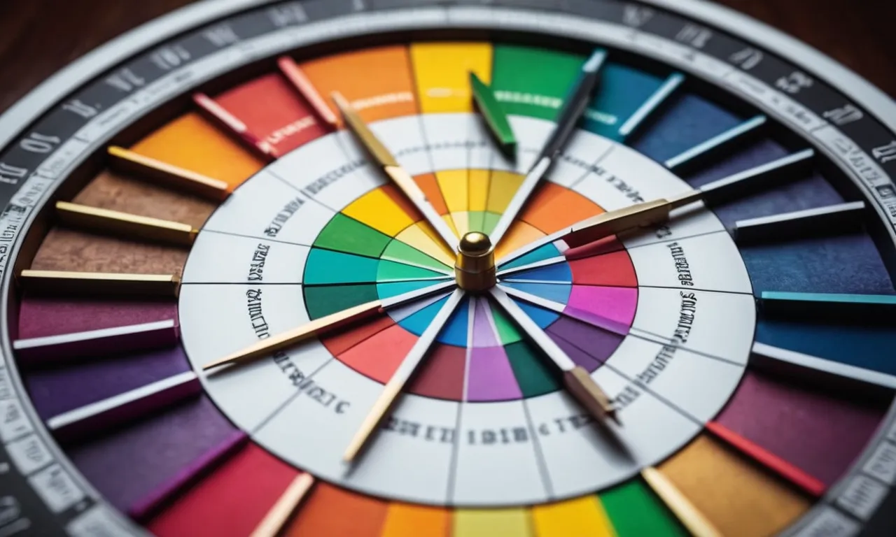
Color Schemes and Harmonies
Achieving visual harmony and balance in interior design and architecture often relies on well-executed color schemes. Complementary color schemes, which use colors that are opposite on the color wheel, create high contrast and vibrancy, making them a popular choice for bold and dynamic spaces.
On the other hand, analogous color schemes, which use colors that are adjacent on the color wheel, provide a more cohesive and soothing aesthetic. The Color Matters website offers a comprehensive guide to understanding and applying various color harmonies, ensuring that your spaces exude a sense of unity and aesthetic appeal.
Feng Shui and Color Symbolism
Feng Shui, an ancient Chinese practice, attributes profound symbolic meanings to different colors, influencing the way they are used in interior design and architecture. For instance, red is associated with energy, passion, and good luck, making it a popular choice for entryways and living rooms.
Green, on the other hand, represents growth, renewal, and harmony with nature, often used in spaces meant for relaxation or meditation. The About Feng Shui website provides a comprehensive color meaning chart, offering invaluable insights into the symbolism and applications of various hues in this ancient practice.
Whether you’re aiming to create a vibrant and energetic atmosphere or a serene and tranquil oasis, understanding the psychology and symbolism behind colors is key to crafting spaces that resonate with your desired mood and ambiance.
By embracing the power of color in interior design and architecture, you can transform ordinary spaces into extraordinary havens that captivate the senses and uplift the spirit. 😊
Color in Fashion and Personal Style
Expressing Personality and Mood Through Color
Colors are not just mere hues; they hold the power to reflect our personalities and emotions. From the bold and vibrant to the soft and muted, the colors we choose for our outfits can speak volumes about our inner selves.
🎨 According to a study by Psychology Today, individuals who gravitate towards warm tones like red, orange, and yellow tend to be more outgoing and energetic, while those drawn to cooler shades like blue and green often exhibit a calmer and more introspective nature.
Furthermore, colors can influence our moods and emotions. Wearing a bright, cheerful hue like yellow can uplift our spirits, while a deep, rich shade like burgundy can evoke a sense of sophistication and confidence.
😊 This relationship between color and emotion is deeply rooted in psychology, as our brains associate certain hues with specific experiences or memories. By carefully curating our color choices, we can use fashion as a canvas to express our unique personalities and desired mindsets.
Color Trends and Seasonal Palettes
In the ever-evolving world of fashion, color trends come and go like the changing seasons. Each year, leading fashion authorities, such as Pantone, unveil their predictions for the upcoming season’s hottest hues.
These forecasts not only influence the fashion industry but also trickle down into home decor, beauty, and even consumer products. 🌈
Keeping up with seasonal color palettes can be a fun and exciting way to refresh your wardrobe and stay on-trend. However, it’s important to remember that true style is about finding a balance between following trends and staying true to your personal aesthetic.
By incorporating a few trendy hues into your existing color repertoire, you can effortlessly update your look while still maintaining your unique flair.
Color Combinations and Outfit Coordination
Mastering the art of color coordination is a skill that can elevate any outfit from ordinary to extraordinary. 💃 While some may opt for a monochromatic look, others might prefer to experiment with complementary or analogous color schemes.
According to Color Matters, a leading resource on color theory, complementary colors (those opposite each other on the color wheel) create a striking contrast, while analogous colors (those adjacent on the color wheel) blend harmoniously.
When it comes to outfit coordination, don’t be afraid to mix and match different hues and textures. A pop of color can add depth and interest to an otherwise neutral ensemble, while a well-curated color palette can create a cohesive and polished look.
👌 Remember, fashion is all about self-expression, so have fun with color and let your unique style shine through!
Conclusion
The color meaning chart is a powerful tool that unlocks the hidden depths of color symbolism and psychology. By understanding the meanings and associations behind each hue, we can harness the power of color to influence emotions, convey messages, and create meaningful experiences.
Whether you’re a marketer seeking to connect with your target audience, an interior designer aiming to create a specific ambiance, or an individual looking to express your personal style, the color meaning chart provides invaluable insights to guide your decisions and choices.
Embrace the vibrant world of color and let its symbolism and psychology enrich your life, enhance your creativity, and deepen your understanding of the world around you.