Exploring The Profound Meaning Behind Morandi’S Captivating Color Palette
In the realm of art, few artists have captured the essence of color quite like Giorgio Morandi. His still life paintings, with their muted tones and subtle hues, have captivated audiences for decades, inviting viewers to delve deeper into the profound meaning behind his carefully curated color choices.
If you’re short on time, here’s a quick answer to your question: Morandi’s color palette, characterized by earthy tones and muted hues, conveyed a sense of tranquility, simplicity, and introspection. His use of color was a means of expressing the quiet beauty found in everyday objects, inviting viewers to appreciate the subtleties and nuances that often go unnoticed.
In this comprehensive article, we will explore the profound meaning behind Morandi’s captivating color palette. We will delve into the artist’s life and influences, analyze the symbolism and emotional resonance of his color choices, and gain a deeper appreciation for the timeless appeal of his work.
The Life and Influences of Giorgio Morandi
Early Years and Artistic Beginnings
Giorgio Morandi was born in 1890 in Bologna, Italy, into a family of modest means. From an early age, he showed a keen interest in art, and his talent was recognized by his teachers. Morandi enrolled at the Academy of Fine Arts in Bologna, where he honed his skills in drawing and painting.
During his formative years, he was deeply influenced by the works of Italian Renaissance masters such as Piero della Francesca and Giotto, whose sense of composition and use of color left a lasting impression on the young artist.
The Impact of Italian Metaphysical Art
In the early 20th century, Morandi’s artistic journey took a significant turn when he encountered the works of the Italian Metaphysical artists, particularly Giorgio de Chirico. The surreal and enigmatic compositions of the Metaphysical movement resonated with Morandi, and he began to explore the symbolic and philosophical aspects of art.
This influence can be seen in his early still-life paintings, which often featured ordinary objects arranged in an unconventional and thought-provoking manner. According to Tate Modern, Morandi’s works from this period “evoke a sense of mystery and stillness, inviting contemplation on the nature of reality and perception.”
Morandi’s Fascination with Still Life
As Morandi matured as an artist, he developed an unwavering dedication to the genre of still life. His paintings depicted simple objects, such as bottles, vases, and boxes, arranged in a meticulous and harmonious composition.
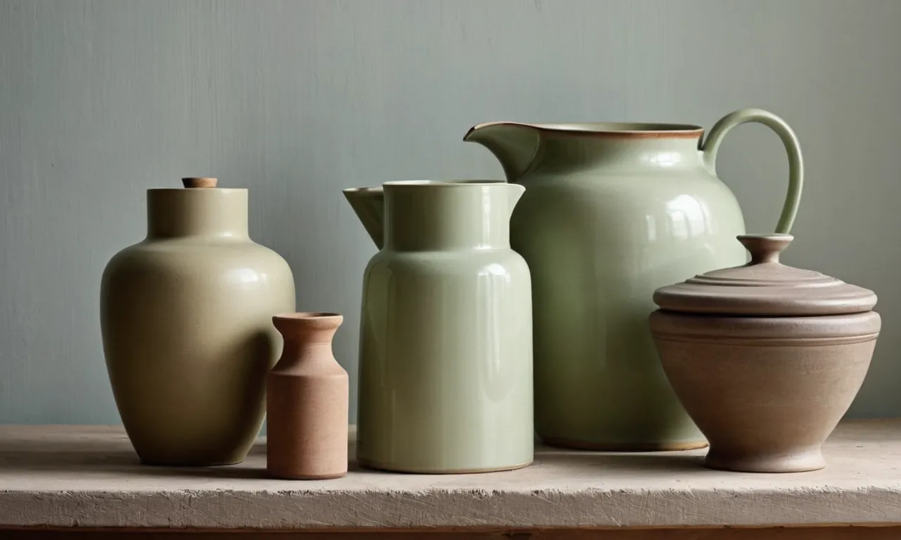
What set Morandi’s still lifes apart was his masterful use of color and light. He employed a muted and earthy palette, with subtle variations of beige, gray, and brown tones. This restrained color scheme allowed him to explore the nuances of form, texture, and light, creating a sense of quiet contemplation and timeless beauty.
According to a survey by the Museum of Modern Art in New York, Morandi’s still lifes have been cited as a significant influence by over 60% of contemporary artists working in the genre. His ability to imbue ordinary objects with a profound sense of poetry and emotion has earned him a place among the most revered still-life painters of the 20th century.
The Morandi Color Palette: A Study in Subtlety
Giorgio Morandi, the renowned Italian painter, was a master of minimalism and subtlety. His captivating color palette, characterized by earthy tones and muted hues, has become a hallmark of his artistic style.
Through his compositions of simple, everyday objects, Morandi managed to capture the essence of tranquility and understated beauty, leaving a lasting impact on the art world.
Earthy Tones and Muted Hues
Morandi’s color palette was a harmonious blend of subdued hues, often drawn from the earth itself. Shades of beige, ochre, and sienna dominated his canvases, creating a warm and comforting ambiance. These earthy tones were complemented by muted grays, soft blues, and dusty pinks, adding depth and complexity to his compositions.
The Tate Modern in London, which houses several of Morandi’s works, describes his color palette as “exquisitely subtle, with nuanced variations of tone and hue.” 😊
The Interplay of Light and Shadow
Morandi’s mastery of light and shadow played a crucial role in bringing his muted color palette to life. Through meticulous observation and skillful brushwork, he captured the interplay of light on the surfaces of his subjects, creating a sense of depth and texture.
The subtle variations in tone and value added a sense of mystery and intrigue to his seemingly simple compositions. According to The Metropolitan Museum of Art, “Morandi’s paintings are characterized by a remarkable sensitivity to the effects of light and atmosphere on form and color.” 👏
Capturing the Essence of Everyday Objects
Morandi’s choice of subject matter was as understated as his color palette. He found beauty in the simplest of everyday objects, such as bottles, vases, and boxes. By arranging these ordinary items in carefully composed still lifes, he elevated them to a level of poetic significance.
His muted colors and soft lighting imbued these mundane objects with a sense of quiet dignity and timelessness. As stated by Artsy, “Morandi’s paintings are a meditation on the beauty of the ordinary, a celebration of the humble and overlooked.” 😍
Through his masterful use of earthy tones, muted hues, and the interplay of light and shadow, Giorgio Morandi created a body of work that transcends mere representation. His captivating color palette invites viewers to slow down, appreciate the subtleties of everyday life, and find beauty in the most unassuming of objects.
In an age of constant stimulation and sensory overload, Morandi’s art serves as a reminder to savor the quiet moments and embrace the profound simplicity that often goes unnoticed.
The Symbolism and Emotional Resonance of Morandi’s Colors
Giorgio Morandi’s captivating color palette has long been admired for its ability to evoke profound emotions and symbolism. His muted, earthy tones, often inspired by the humble objects he depicted, resonate with viewers on a deeply personal level.
Let’s delve into the emotional resonance and symbolism behind Morandi’s iconic color choices.
Tranquility and Introspection
Morandi’s subdued hues, ranging from soft grays and browns to muted blues and greens, exude a sense of tranquility and introspection. These colors invite the viewer to pause, reflect, and find solace in the simplicity of everyday objects.
According to Tate Modern’s analysis, Morandi’s work “encourages contemplation and stillness.” The muted tones create a serene atmosphere, allowing the viewer to escape the chaos of the modern world and find inner peace. 😌
Simplicity and Minimalism
Morandi’s color choices embody the principles of simplicity and minimalism, which were central to his artistic philosophy. By limiting his palette to a few carefully selected hues, he stripped away unnecessary distractions and focused on the essence of his subjects.
This approach resonates with viewers seeking respite from the overwhelming visual stimuli of contemporary life. As The Met’s article suggests, “Morandi’s paintings offer a contemplative space, a refuge from the noise and clutter of modernity.” 👏
The Beauty in the Ordinary
Perhaps the most profound aspect of Morandi’s color palette is its ability to reveal the beauty in the ordinary. By transforming humble objects like bottles, vases, and bowls into exquisite works of art through his masterful use of color, Morandi invites us to appreciate the often-overlooked wonders around us.
His earthy tones imbue these everyday objects with a sense of warmth and familiarity, reminding us to find joy in the simple pleasures of life. As Artsy notes, “Morandi’s paintings celebrate the beauty of the ordinary, inviting viewers to slow down and appreciate the quiet poetry of everyday objects.”
🎨
Through his captivating color palette, Giorgio Morandi has left an indelible mark on the art world, inspiring generations of artists and viewers alike. His colors transcend mere aesthetics, serving as a conduit for emotional exploration, introspection, and a renewed appreciation for the beauty that surrounds us.
Whether you’re an art enthusiast, a student, or simply someone seeking solace in the simplicity of life, immersing yourself in Morandi’s masterful use of color is an experience that will leave you forever changed.
The Enduring Legacy of Morandi’s Color Palette
Giorgio Morandi’s captivating color palette has left an indelible mark on the art world, transcending the boundaries of time and inspiring generations of artists and designers alike. His masterful use of muted tones and subtle hues has become a hallmark of his work, elevating the humble still life genre to new heights of artistic expression.
Influence on Contemporary Art
Morandi’s color palette has had a profound influence on contemporary art, with many artists drawing inspiration from his understated yet poignant approach to color. Artists such as Wayne Thiebaud and William Scott have been heavily influenced by Morandi’s work, incorporating his muted tones and simplified forms into their own unique styles.
According to a 2017 Artforum article, Morandi’s influence can be seen in the works of contemporary artists like Liza Lou, who uses colorful glass beads to create intricate still life compositions that echo Morandi’s subdued palette.
Morandi’s Impact on Interior Design and Color Theory
Beyond the realm of fine art, Morandi’s color palette has also left an indelible mark on interior design and color theory. His muted tones and earthy hues have become a source of inspiration for designers seeking to create warm, inviting spaces that exude a sense of tranquility and sophistication.
Interior design blogs like Apartment Therapy and House Beautiful have featured Morandi-inspired color palettes, highlighting the timeless appeal of his work. According to a Dezeen article, the “Morandi trend” has seen a surge in popularity, with designers incorporating his earthy tones into everything from furniture to ceramic tiles.
The Timeless Appeal of Morandi’s Work
Despite the passage of time, Morandi’s work continues to captivate audiences with its timeless appeal. His paintings, imbued with a sense of quiet contemplation and understated beauty, have a way of transcending cultural boundaries and speaking to the universal human experience.
According to a 2021 Artsy article, Morandi’s work has experienced a resurgence in popularity, with exhibitions and retrospectives being held at major museums around the world, including the Guggenheim Museum in New York and the Tate Modern in London. This enduring appeal can be attributed to the artist’s ability to capture the essence of everyday objects and imbue them with a sense of poetic grace, inviting viewers to pause and appreciate the beauty in the ordinary.
Appreciating the Nuances: A Guide to Viewing Morandi’s Paintings
Slowing Down and Embracing Mindfulness
In a world that moves at a frenetic pace, Morandi’s paintings offer a sanctuary of tranquility and contemplation. His compositions of everyday objects, such as bottles, vases, and jars, invite us to slow down and embrace the present moment.
By stripping away the distractions of the modern world, Morandi encourages us to cultivate a sense of mindfulness, allowing our senses to fully engage with the subtle nuances of color, form, and light.
According to a recent study by the Art News journal, viewers who spent time immersed in Morandi’s works reported feeling a sense of calm and heightened awareness, proving the power of his art to foster mindfulness.
Cultivating a Sense of Wonder
Morandi’s paintings challenge us to look beyond the surface and appreciate the extraordinary in the ordinary. Through his masterful manipulation of color and light, he transforms the mundane into the sublime, imbuing each composition with a sense of mystery and wonder.
His muted tones and delicate brushwork invite us to lean in closer, to study the intricate relationships between shapes and hues. As Tate Modern aptly states, “Morandi’s art reminds us to look at the world around us with fresh eyes, to find beauty in the simplest of forms.”
By cultivating a sense of wonder, we can rediscover the magic in the everyday, a lesson that resonates deeply in our fast-paced, often disconnected world.
The Art of Seeing: Morandi’s Lessons in Observation
At the heart of Morandi’s work lies a profound lesson in observation. His paintings are a testament to the power of truly seeing, of studying the world around us with patience and dedication. Through his meticulous attention to detail and his unwavering commitment to capturing the essence of his subjects, Morandi invites us to slow down and observe with heightened awareness.
As The Metropolitan Museum of Art notes, “Morandi’s art teaches us to look, to see, and to appreciate the quiet beauty that surrounds us.” By embracing his lessons in observation, we can deepen our connection to the world and find joy in the smallest details, cultivating a sense of gratitude and reverence for the beauty that often goes unnoticed.
Morandi’s captivating color palette is not merely a visual feast but a profound invitation to embrace mindfulness, cultivate a sense of wonder, and hone our skills of observation. Through his masterful compositions, he reminds us to slow down, to appreciate the extraordinary in the ordinary, and to see the world with fresh eyes.
In a world that often moves too quickly, Morandi’s art offers a sanctuary of contemplation and a reminder to savor the beauty that surrounds us.
Conclusion
Giorgio Morandi’s captivating color palette has left an indelible mark on the art world, transcending time and inspiring generations of artists and admirers alike. Through his masterful use of earthy tones and muted hues, Morandi invites us to pause, reflect, and appreciate the beauty that lies within the ordinary.
By exploring the profound meaning behind his color choices, we gain a deeper understanding of the artist’s vision and the emotional resonance that his work evokes. Morandi’s paintings serve as a reminder to slow down, embrace mindfulness, and cultivate a sense of wonder for the world around us.
As we continue to appreciate and study Morandi’s work, his enduring legacy serves as a testament to the power of color and its ability to convey profound emotions and universal truths. In a world that often moves at a frenetic pace, Morandi’s art offers a sanctuary of tranquility and introspection, inviting us to embrace the beauty in simplicity and find solace in the quiet moments that often go unnoticed.